Colour systems explained.
PART 2: How to use them to build better brands
Colour systems can be difficult to understand but they are also crucial for effective brand building – something we wanted to take the time to focus on in the second half of this blog double-header.
If you’ve made it here through the acronym ocean that is Part One of this blog, then well done!
If you haven’t, and colour systems are still a mystery to you, then please head back to get the low down on exactly what colour systems are before diving in here.
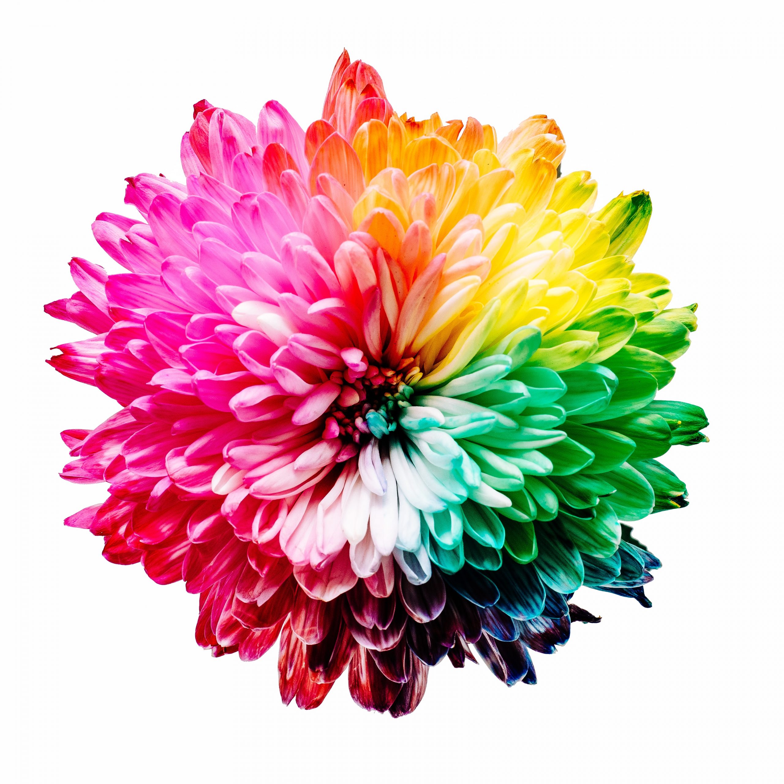
Colours can be matched across systems, to coexist on print and digital
When we are creating a brand identity that needs to be used in both print and digital designs, as most are, we always start with a Pantone colour and convert it to RGB/HEX using PMS (the Pantone Matching System) rather than the other way around.
This is because the print colour systems (Pantone and CMYK) are naturally more limited by the physical properties of inks, whereas their digital counterparts can be varied innumerably, making it easier to find a match.
While it may be tempting for small businesses or start-ups to consciously think of themselves as “digital-first” or inadvertently use digital colour systems to design their identities, this can cause issues further down the line when their brand, now firmly established, cannot be accurately replicated in print for adverts, marketing materials or unforeseen physical products.
But why is it so important to find a match, anyway?
Colour consistency is key to brand continuity across multiple channels
Colour is key to keeping all your marketing materials looking sharp and consistent across print, web, and production.
If you and/or your creative agency have painstakingly chosen just the right colour palette for your brand, there is no reason not to replicate that everywhere your brand appears! Accurate colour consistency is crucial for establishing a strong identity, connecting with your audience, and eventually improving your brand recognition.
Some studies suggest that using a signature colour can increase brand recognition by as much as 80% – think of Starbucks’ forest green or IKEA’s gloriously clashing yellow and blue.
The best way to communicate your chosen colour(s) is through your brand guidelines
This is where a creative and comprehensive brand book really comes into its own. Whenever we’re sharing a new identity with a client, we make sure that each colour in every colour palette is clearly listed in the PMS, CMYK, RGB and HEX colour systems.
In summary (AKA the TLDR)
Colour systems are important! There are four of them and you need to know the codes for the colour(s) in your brand identity, especially the logo, in each colour system in order to achieve consistency across channels. Which you really need to do in order to build a strong, consistent and easily recognisable brand.
When designing a logo, start with colours in Pantone/CMYK and convert to RGB/HEX – not the other way round – to avoid falling into the trap of establishing a brand that then can’t be easily communicated across all media in the future.
Are you building a brand that needs a bold and brilliant identity that will work across all channels? Or have you created a digital identity and need help translating it onto physical media? Give our friendly team a call today – we’re more than happy to help.