Colour systems explained.
PART 1: What are they?
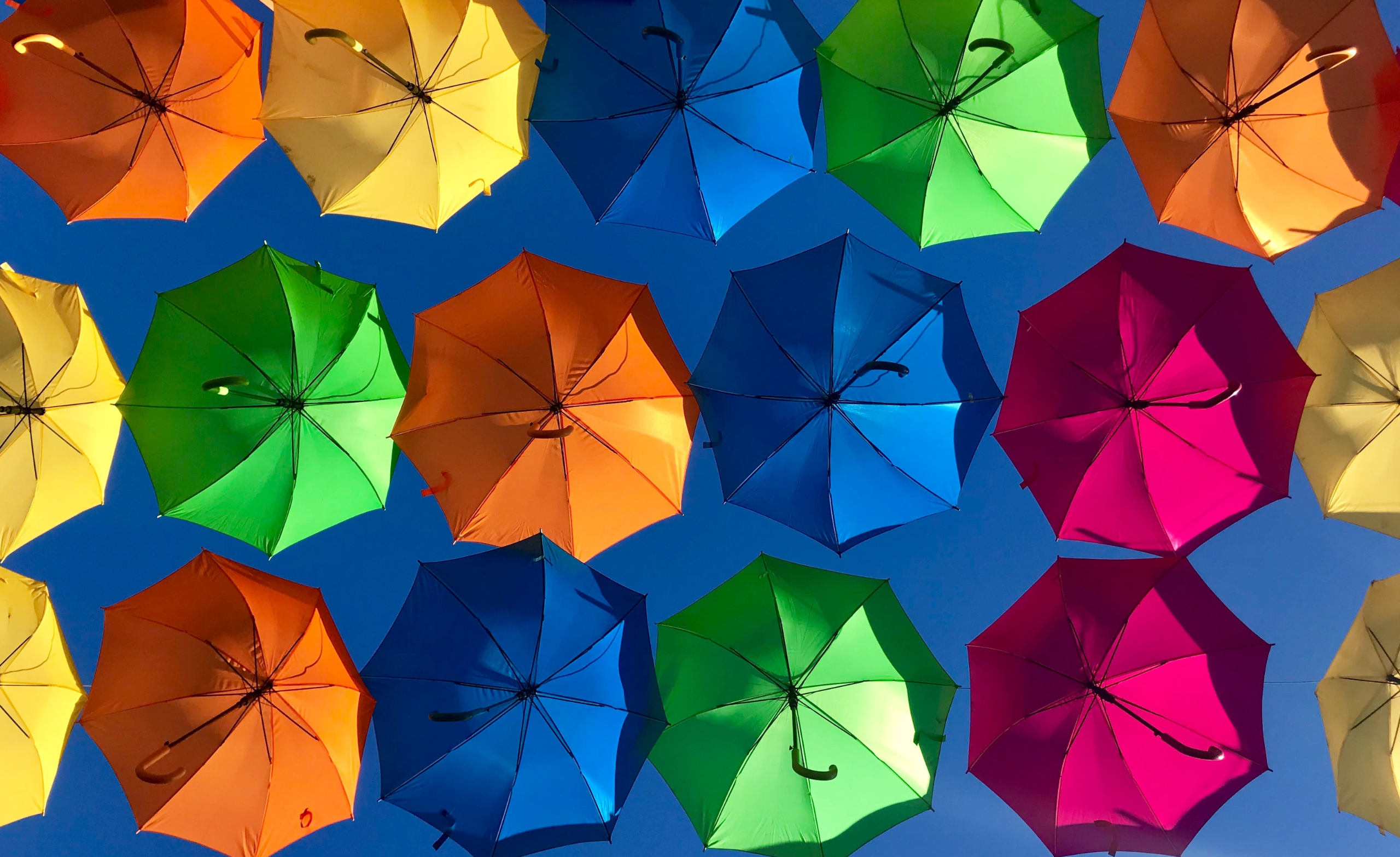
As designers we love working with colour. We live and breathe colour. Barely a day goes by without some kind of spirited office discussion about the shade or hue of a particular tone and its suitability for the font, background or logo design in hand.
But we realise not everyone is, shall we say, as colour obsessed as we are.
Many of our clients are small (and large) business owners, entrepreneurs and marketing managers who just need their brand colours to work. And explanations about complicated colour systems that are blocking this seemingly simple endeavour can be hard to comprehend.
So in this piece we want to demystify colour systems:
Part one will unpack what they are and what the (many) acronyms mean
Part two will explain how to use them to build a better brand
Spoiler alert! There are going to be a LOT of acronyms in this piece so TBH if you CBA right now you can always BRB another time… But, TBF, colour systems are GR8. So don’t get FOMO – stick around for the full D/L. Or if it’s TMI for you ATM, you can always skip straight to the TLDR [LINK] at the end of pt2.
There are four main colour systems: CMYK, Pantone, RGB & HEX
CMYK
This colour system is mostly used in print, like magazines, flyers or outdoor advertising. It stands for the four colours applied during the printing process: Cyan, Magenta, Yellow, and Black (AKA key because, you know, B for blue was already taken).
It is what’s called a subtractive colour system, meaning that ink is removed to obtain lighter colours when applied to a usually white surface, like paper.
Pantone
The iconic Pantone colours (of which there are over 2,000) are also primarily used in print. Pantone colours are made with thirteen base pigments that create a variety of unique colours which are then listed as a number on guides that can be found in every drawer of every creative studio, ever (we imagine.)
This numeric system means colour matching is more accurate, and avoiding inconsistencies is easier, than on other colour systems – making it perfect for brand identity work.
RGB
Made up of the primary colours, RGB (Red, Green and Blue) is probably the most recognisable colour system for digital design. It uses a series of numbers from 0-255 to represent each primary colour, which then mix to create every other colour imaginable.
It is what is called an additive colour system, because when you add all the colours together, they create white. Because it exists on screens and therefore uses light instead of ink, RGB colours are usually more vibrant than CMYK.
HEX
Hexadecimal (HEX) code is basically a shorter and easier version of RGB. Used by most developers and an increasing number of DIY brand builders, the HEX code replaces the 0-255 series, with a six-digit combination of letters (A to F) and numbers (0 to 9)
There is thought to be more than 16 million unique colours possible via the HEX code, which is actually more than the human eye can even perceive. So the possibilities are endless.
So now you know what colour systems are – head straight on over to Part Two to find out how to use them to build a better brand.