Kerning: The Good, the Bad, and the Unreadable
In the world of design, where every detail counts, kerning walks the tightrope between clarity and chaos.
But what exactly is kerning, and why should you, the astute business owner or marketing maestro of an SME, care about it? Let’s dive into the nitty-gritty of kerning – the unsung hero of legibility in typography.
What is Kerning?
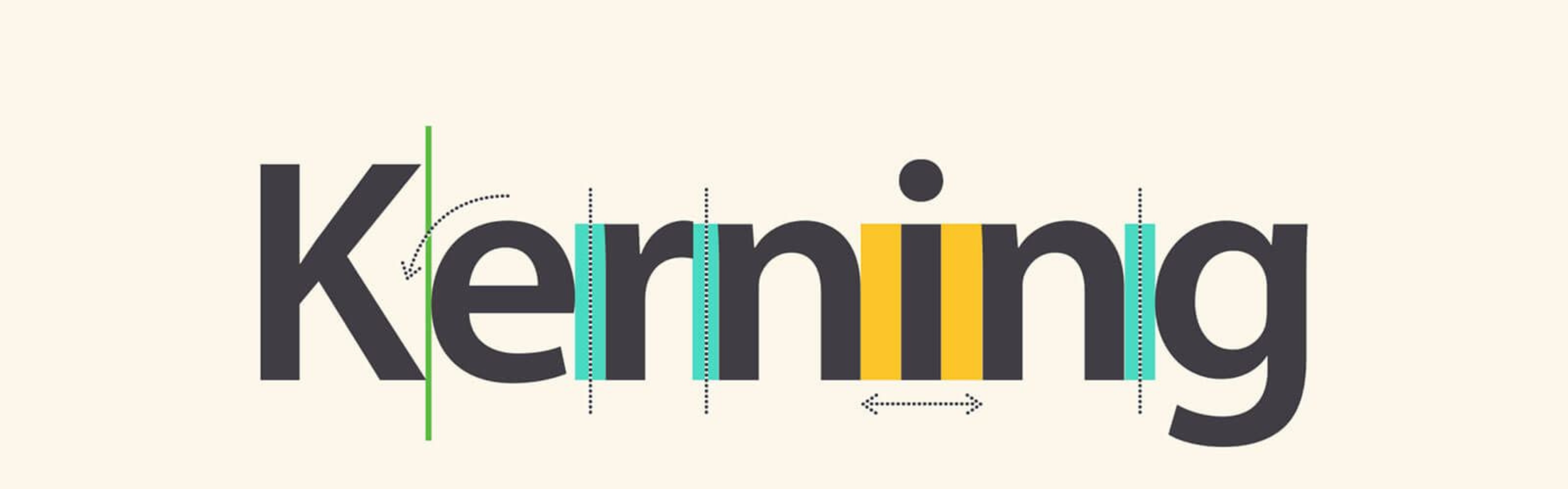
Kerning, in its simplest form, is the adjustment of space between characters in a typeface. It’s not just about making text look ‘nice’; it’s a crucial tool for enhancing readability and ensuring your message is not just seen but understood. In the realm of branding and marketing, where first impressions are everything, kerning can be the difference between a message that resonates and one that falls flat.
The Good: Kerning and Legibility
When kerning is done right, it’s like a harmonious symphony – you don’t necessarily notice it, but you feel its impact. Good kerning ensures that text is pleasant to read, with each letter comfortably occupying its own space, allowing for easy navigation through words. It’s about creating an invisible path that guides the reader’s eye from one letter to the next, making your content not only legible but engaging.
The Bad: When Kerning Goes Awry
On the flip side, poor kerning can be the visual equivalent of a discordant note, jarring the reader and obscuring your message. Letters that are too close can merge into an indecipherable blob, while too much space can disjoint words, disrupting the reading flow. It’s a fine balance, and getting it wrong can render your carefully crafted messages illegible.
The Ugly: Kerning Disasters and How to Avoid Them
We’ve all seen them – kerning mishaps that turn an innocent word into something unintentionally hilarious or outright offensive. These are the moments where kerning leaps from a background design element to the forefront of a branding blunder. The key to avoiding these pitfalls? Attention to detail and an understanding of your typeface’s quirks. And when in doubt, test your designs on fresh eyes – sometimes, what you miss, others will catch.
Beyond the Basics: Kerning in the Digital Age
In the age of digital typography, kerning has taken on new dimensions. With the advent of responsive design, how kerning translates across different devices and screen sizes is more important than ever. A headline that looks perfect on a desktop might be a jumbled mess on a mobile phone. The solution? Embrace technology that adapts kerning dynamically, ensuring your message remains clear, no matter where it’s viewed.
Kerning as a Reflection of Your Brand
Kerning might seem like a small detail, but in the world of design, details are the building blocks of your brand. How you handle kerning speaks volumes about your attention to detail and commitment to clarity and professionalism. It’s an opportunity to show your audience that you value their reading experience, reinforcing the trust and respect at the heart of your brand identity.
In the dance of design, kerning is an essential step, ensuring your message moves with grace and clarity. From the subtleties of spacing to the challenges of digital adaptation, mastering kerning is an investment in your brand’s voice and visibility. So, as you craft your next campaign or refresh your branding, remember: kerning might just be the secret ingredient that elevates your message from good to unforgettable.
Together, we can create experiences that not only look great but communicate clearly and effectively. 🌟
—————————————————————————
Get in touch with one of our CREATIVE CAPTAINS today to discuss your next project!