Avery Brand Update, Completed!
With a large and rapidly growing portfolio of premium elderly care homes, Avery is changing perceptions of how care is delivered today. With its logo already established, our brief was to develop comprehensive brand guidelines that would update and complete the rest of the brand identity and then implement it across all marketing touchpoints and channels.

A prestigious and premium brand in need of an update
The leadership team at Avery knew that they didn’t want to change the Avery Healthcare Group brand mark, which is made up of the ‘Avery’ text and, what is affectionately known inhouse as, the ‘Care and Embrace’ icon. But they agreed that the other elements that made up the brand identity needed updating in order to support the continued growth of the organisation.
Following extensive research, home visits and liaison with the board of directors, Avery’s marketing department provided Soap with a detailed brief and moodboard and we collaborated closely to roll out the brand completion project in three phases over the following months.
1. Colours, fonts & brand guidelines
First up; working in partnership with the Avery Marketing team, we developed a fresh and modern colour palette. The primary palette features a warm blue and a calming grey and the secondary palette adds brightness and sophistication through gold, purple and pink.
Typography-wise, a versatile sans serif typeface is used for use both on and offline content. With its generous x-height and subtly curved strokes, Gesta’s modern look and warm feel is just right for this brand.
In this phase we got the brand guidelines underway and, together, we were able to firm them up as we delved into the second phase.

2. Design concepts
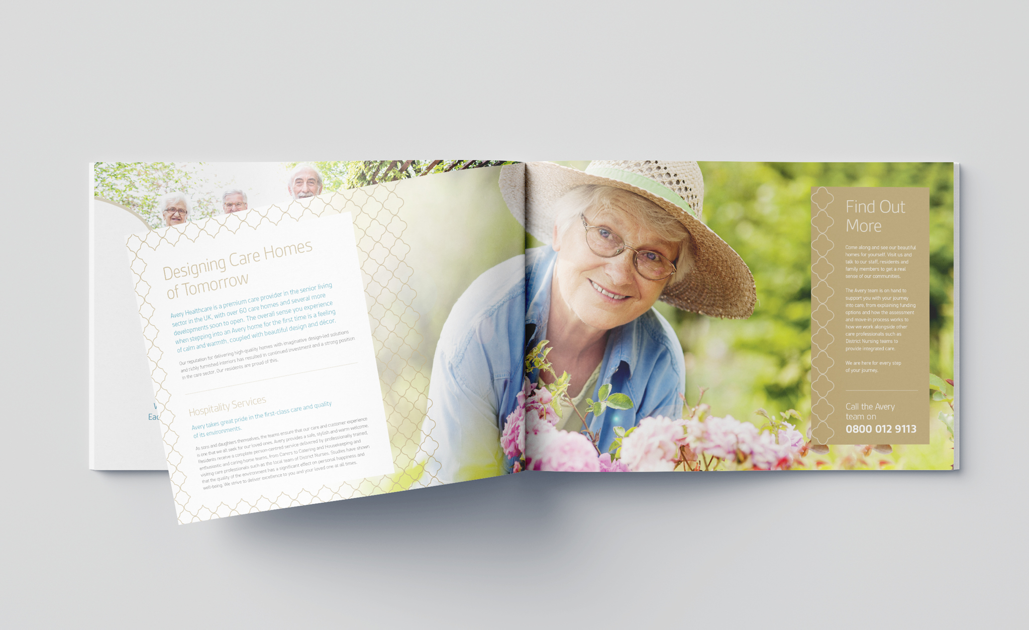
As designers, we loved the challenge of creating brochures for both the overarching Avery brand and individual homes that could work together, and in isolation, to embody Avery’s cultural values, which are: proud, supportive and caring.
We also created artwork examples and guidelines for general, large format and digital advertising and, finally, for recruitment – which is absolutely crucial collateral for a company that truly values its staff. Working in close partnership with the Avery team was key to the success of this phase of the project.
3. Plaque, pattern and photographic style
It was clear from Avery’s brief that highlighting the presence of friendly staff and their interactions with residents would be a real asset for this growing organisation and we knew that selecting the right photography would be key to reflecting this. So bright and light imagery is chosen to compliment the Avery colour palettes, with an emphasis on depicting joyful scenes and caring staff.
Alongside photography (or in place of it, where it’s not quite right), graphic and watercolour illustrations are a brilliant way to soften campaigns. The new guidelines mean that Avery’s illustrations and paintings are created or re-coloured to adopt its primary and secondary colour palettes, adding to a cohesive brand identity and design.
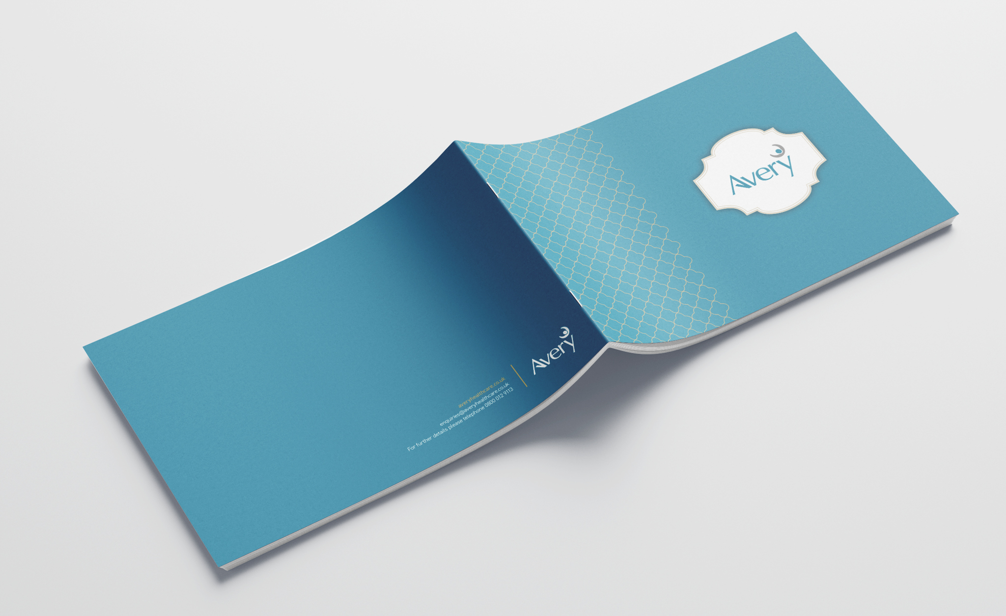
New for the 2022 project, and inspired by the soft furnishing and decor in the homes themselves, we introduced the Avery plaque and pattern assets. The ornate shape of the Avery Plaque holds photography and frames the logo on new collateral. And the Avery pattern, which we knew from the brief was a much-loved interior design element for staff and residents alike, is introduced in graphical form in both horizontal and vertical profiles to add texture to artwork.
By reflecting the look and feel of Avery’s homes, the new guidelines smoothly blend marketing materials with the physical experience of visiting or living in an Avery home.
A leading and luxury brand with an identity to match
We have supported Avery’s growth from 13 to over 60 homes and we’re looking forward to building on that as this brilliant brand continues to grow. We are proud that their senior leadership team sees us as an extension of their marketing team and it has been fantastic to see the completed brand brought to life across so much collateral already.

A completed brand and a happy client
We loved working on this project, but how did it go from the client’s perspective? Here’s what Angela Bailey, Marketing Manager at Avery Healthcare had to say about working with Soap:
“Soap Creative has been our agency of choice for several years, and our relationship is such that they feel like an extension of our team. They produce wonderful creative, and their friendly team is extremely accommodating and flexible to meet our ever-changing needs and priorities as our organisation has rapidly experienced growth. A huge benefit of having Soap on board is their operational management of our projects from brief to concepts, artwork sign-off, and then print/production and fulfilment.
The Soap team took on our brand completion project with enthusiasm. They listened to the brief and helped to guide us through step by step, not hesitating to challenge us if they felt the need. Because they have a comprehensive understanding of our organisation and our history, the process was seamless.”
If you have a brand that needs to be updated, or completed, why not get in touch?